

Timeline
November 2021 - February 2022
My Responsibility
End to end design
ProblemWorking professionals are annoyed by sloppy experiences at food trucks
In today's fast-paced life, working people with young families are always busy and looking for ways to optimize time and improve experiences. Food trucks are one of the places where things can be chaotic and this causes them inconveniences.
Final designStreamlined and informed services with faster checkouts


User interviewsMy users are more likely to buy from food trucks if they can avoid long queues and experiences are predictable

Meet my Persona
InsightsUsers like a product that is uncluttered and help them have a great experience

Market researchMy user research and insights directed me to figure out the best ways to solve the pain points of my persona. I had several ideas but also needed to verify the feasibility and effectiveness of my approach. So I conducted literature and market research, and here are the key findings.
Guest checkout:
24% of orders are abandoned during checkout because of the need to create an account
In a study by Baymard Institute, the need to create an account during checkout is the second biggest reason for not proceeding with an order in e-commerce.

I hypothesized that a guest checkout will:

Payment processing feasibility:
Secure payment processing is feasible with only 5 credit card fields
To enable guest checkout with minimum user actions, I had to make sure if it is feasible to process payments without an email address. Check Stipe API documentation.

I did feasibility checks by:

Authentic reviews:
Independent, validated and trustworthy reviews can increase sales by as much as 270%
To ensure a quality experience, it is critical that my users can find good food trucks. One of the ways this can be made possible is through authentic reviews. One BrightLocal study shows that 87% of people read reviews and 79% trust them as much as they would a personal recommendation. Further, a recent Northwestern University study suggests that having at least five quality product reviews can increase the likelihood of purchase by 270%.
Solution choices & hypotheses to solve the problem of fake reviews:

Competitive analysis & the gapThe competitors are not offering guest checkouts
My competitors don’t focus on providing a streamlined experience for guest checkouts. On the other hand, my user persona does not want to share any personal information or take any extra step in processing an order. This is an opportunity for my solution to provide a faster checkout and allow users to experience the product before registration.

DesignTransforming insights into a solution
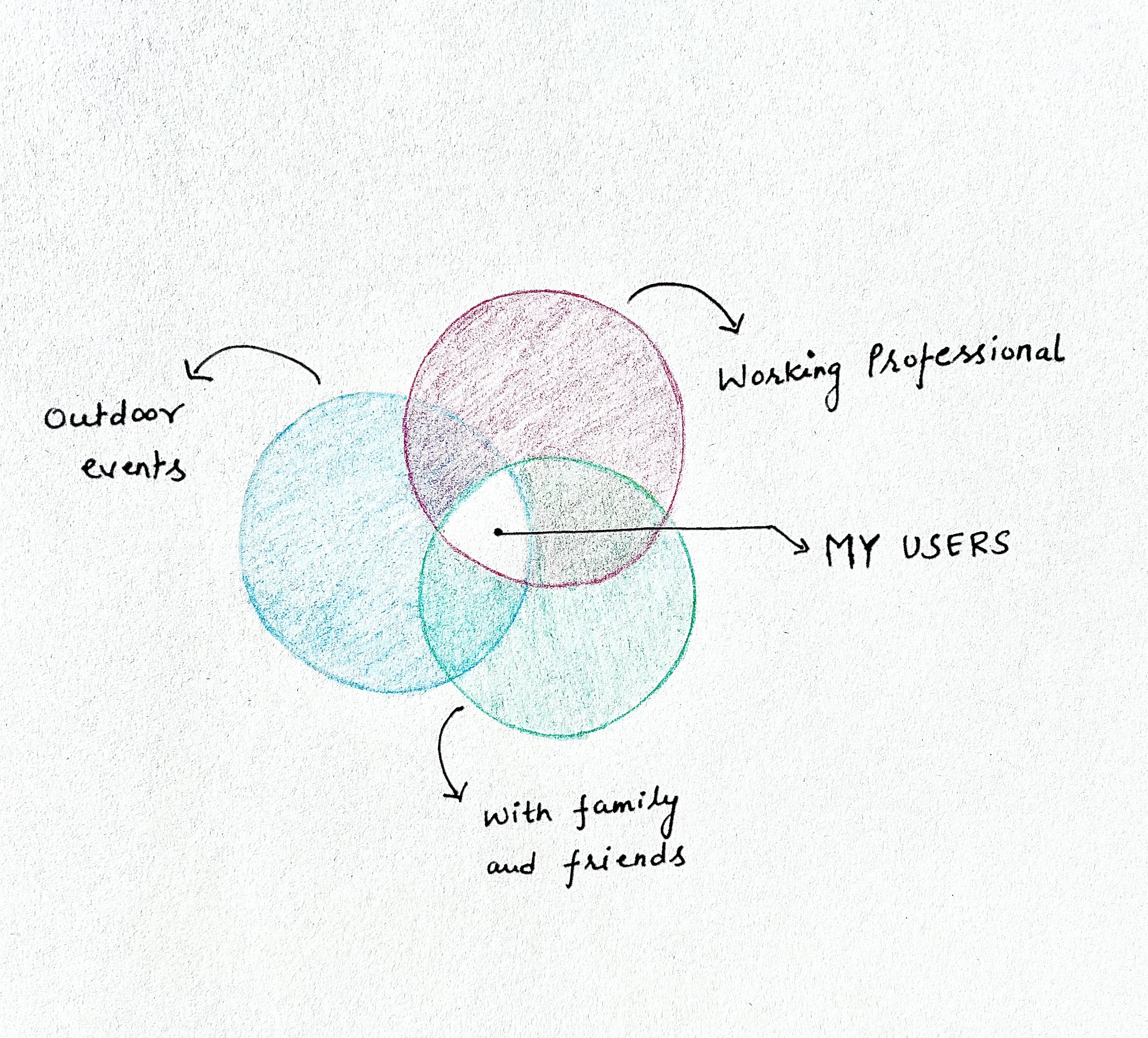
Venn diagram
My persona has three broad features:
The user is a busy working professional who values organization and consistency in experiences
The user enjoys outdoor events during the weekend
The user is generally with family and friends.
To improve their experience with food trucks, I explored if the right product will be a website or an app. I also explored if the product should handle food delivery or just food pick up. Since the persona's location is not fixed over the weekend, it makes sense that the product will manage the scenario of food ordering and pick up. Second, since the persona is not necessarily carrying a laptop, an app may help the user place orders faster with a tight and focused workflow. Hence, I decided to proceed with designing an app.
Site map:
This is the site map of the app. The idea is to organize the information such that the user can navigate through it intuitively.

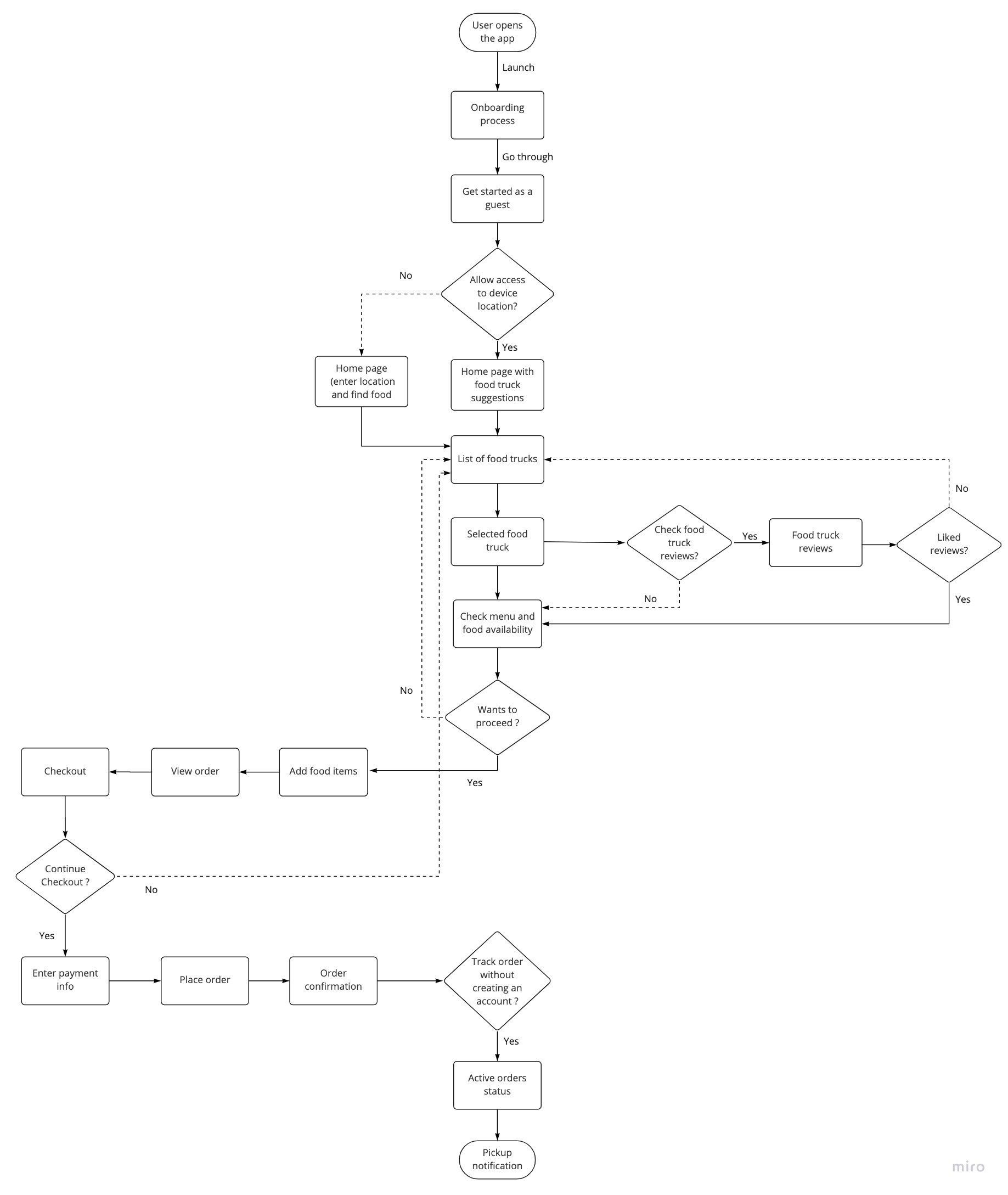
First-time user flow with guest checkout:
I created a flow for Abeba’s first-time experience with the app. Abeba does not need to create an account to process the order. I want the user to explore the app and see if it is something they are interested in.
The user will have additional benefits of registering like faster repeat orders and providing reviews to food trucks. This flow is not shown here.
Paper wireframes:
With my persona, information architecture, and the user flow defined, it was time to plan what the app will look like. I started with paper wireframes and then moved on to create the low-fidelity prototype.
Here are six variations of the home screen that were considered. I prioritized ease of use and a search process that is fast and intuitive for the users.


Low-fidelity prototype:
Now it was time to design the low-fidelity prototype for the first usability testing.
Digital wireframes reflect user research. I designed a home screen that can help users quickly search and show nearby food trucks
Users can check authenticated reviews from previous customers and can browse the menu for available food items
Users can process orders faster without signing up/signing in
Users create an account to save history and provide authentic reviews

Usability testing 1Iterating the design
I conducted an unmoderated usability study using the low-fidelity prototype with 6 users. To have a diverse group, my participants were 2 males and 4 females between the ages of 24 to 65. Each study took 15 to 20 minutes and it was conducted remotely.
Key insights and improvements:


Usability testing 2Refining the design
Based on the insights from the first usability study, I refined the design and created a high-fidelity prototype to conduct the second round of testing. I also gathered feedback from some of my mentors on my Hi-fi Prototype this study.
Final improvements:


The final product The final screens

Clickable prototypeStyle guide

conclusionFinal thoughts and takeaways
This was my first UX design project ever! While it was overwhelming at times, it has been a phenomenal journey to learn every new step of the process. With this said, here are my key learnings:
Empathy and problem solving: A very important learning for me is that as a UX designer, my objective is to design products that solve a user’s problems. It is very important to empathize with users and stand in their shoes to really understand their pain points. Only a deeper understanding of the user can help us create meaningful products.
Removing biases through user research: I absolutely loved the research part of the project and cannot emphasize its importance enough. With carefully designed questions, we can remove biases and really gather insights to build a product for the actual user and not for us. Thorough research at the early stage also reduces the number of iterations at the later stages of the usability testings.
Feedback and iterations: Another important learning has been that we should be open to feedback and even criticism from both users and mentors. For a designer, feedback is a very important aspect of learning, improvement, and personal growth. The strategy is not to take those feedback personally and objectively convert it into product improvements. Feedbacks are also key to the agile and lean methodology where useful products are developed with reduced wasted efforts and resources.
This endeavor has also taught me how to work efficiently on future projects and these are my takeaways:
Planning with smaller milestones: It helps immensely to build a plan for the project at the beginning and execute on that. Various steps of the project can be quite confusing and can take a lot of time. However, achieving smaller milestones keep things organized and motivated for the project.
Structure and organization: It is very important to prepare design components and organize the project for multiple iterations. This helps in rapidly implementing user feedback in the design.